

Edit scenes and cards
What intro cards, title cards, logo reveals, lists, text beats, video scenes, clips and the video cover are, how to add them, every field you can edit, card backgrounds including animated motion backgrounds, and how scene templates work.
Besides the narrated steps of your recording, a how-to video or product demo can hold full-screen scenes: an intro card, title cards, a logo reveal, a list, text beats, an uploaded video, and clips or pictures from your recording. This article explains what each one is for and every field you can edit.
Before you start
- Scenes are in the video editor for how-to videos, product demos and Polish videos. Social clips are built from scenes the AI director writes; see Edit a social clip.
- You need edit rights. Adding and editing scenes is free, except recording a List voiceover, which uses credits like any voice-over line.
Scenes, steps and elements
The scene row of the timeline plays one thing at a time, left to right:
[Intro card][Step 1][Step 2][Title card][Step 3][List][Step 4][Logo reveal]
| Kind | What it is | Its length comes from |
|---|---|---|
| Step | A narration line with part of your recording | The narration and its clips. See Use sync and pacing. |
| Scene (this article) | A full-screen card or clip that replaces the recording while it plays | Its own Duration, or its content |
| Element | Text, an image, blur and so on, placed on top of steps and scenes | Its block on the timeline. See Add and edit elements. |
Inserting a scene pushes everything after it later; deleting one pulls it earlier. "The surrounding clips will stay unchanged."
Add a scene
- Move the playhead to where the scene should go.
- Click + in the timeline toolbar (Add to the timeline at the playhead), or the + between two scenes on the timeline.
- Pick a scene under Scenes or From your recording. Its editor opens.
- Fill it in and click Save.
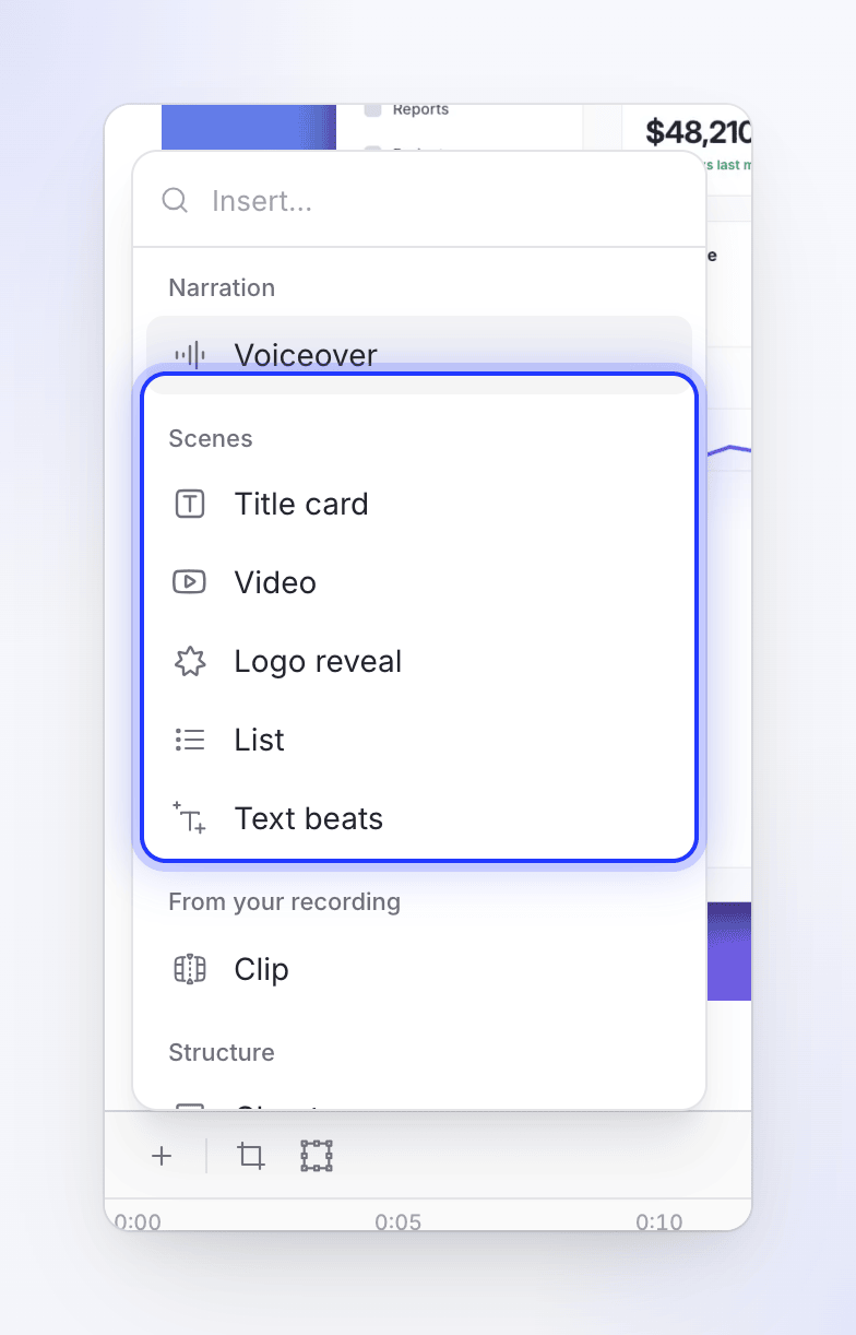
| Menu item | Description |
|---|---|
| Title card | "Full-screen scene with on-screen text." |
| Video | "Insert an uploaded video clip." |
| Logo reveal | "Animated logo reveal scene." |
| List | "Animated list of product features." |
| Text beats | "Kinetic typography with animated beats." |
| Clip | "Silent clip from your screen recording." Recordings and uploads only. |
| Image | "Show one of your pictures as its own scene." Only when the video has pictures among its sources. |
The same menu also has Voiceover under Narration (a new narrated step; see Edit the script and voice-over) and Chapter under Structure ("Section heading to organize your video."). The intro card is added separately, with Add an intro card at the top of the Script tab.
Edit or delete a scene
- Edit: double-click the scene on the timeline, or click Edit scene (the pencil) on its row in the Script tab. Right-click on the timeline also has Edit.
- Move: drag the row by Drag to move scene in the Script tab.
- Delete: Delete scene in the row's menu, the editor's ⋯ menu, or right-click → Delete on the timeline. It asks first.
Scene blocks can't be dragged or trimmed on the timeline. Change their length with Duration in their editor.
Every scene editor has Save at the bottom. The ⋯ menu has Load template…, Save as template… and Delete.
Intro card and title card
Both are full-screen cards with text and images over a background. They use the same editor.
| Intro card | Title card | |
|---|---|---|
| Header | "Opens the video, before the first step" | "A full-frame card between steps" |
| How to add | Add an intro card ("A title screen before the first step") in the Script tab. The button disappears once you have one. | + → Title card, anywhere |
| Text source | Screencast title (the video's title, filled in automatically) or Custom text | Your own text |
| Typical use | The video's name and your brand | A chapter heading: "Part 2: Inviting your team" |
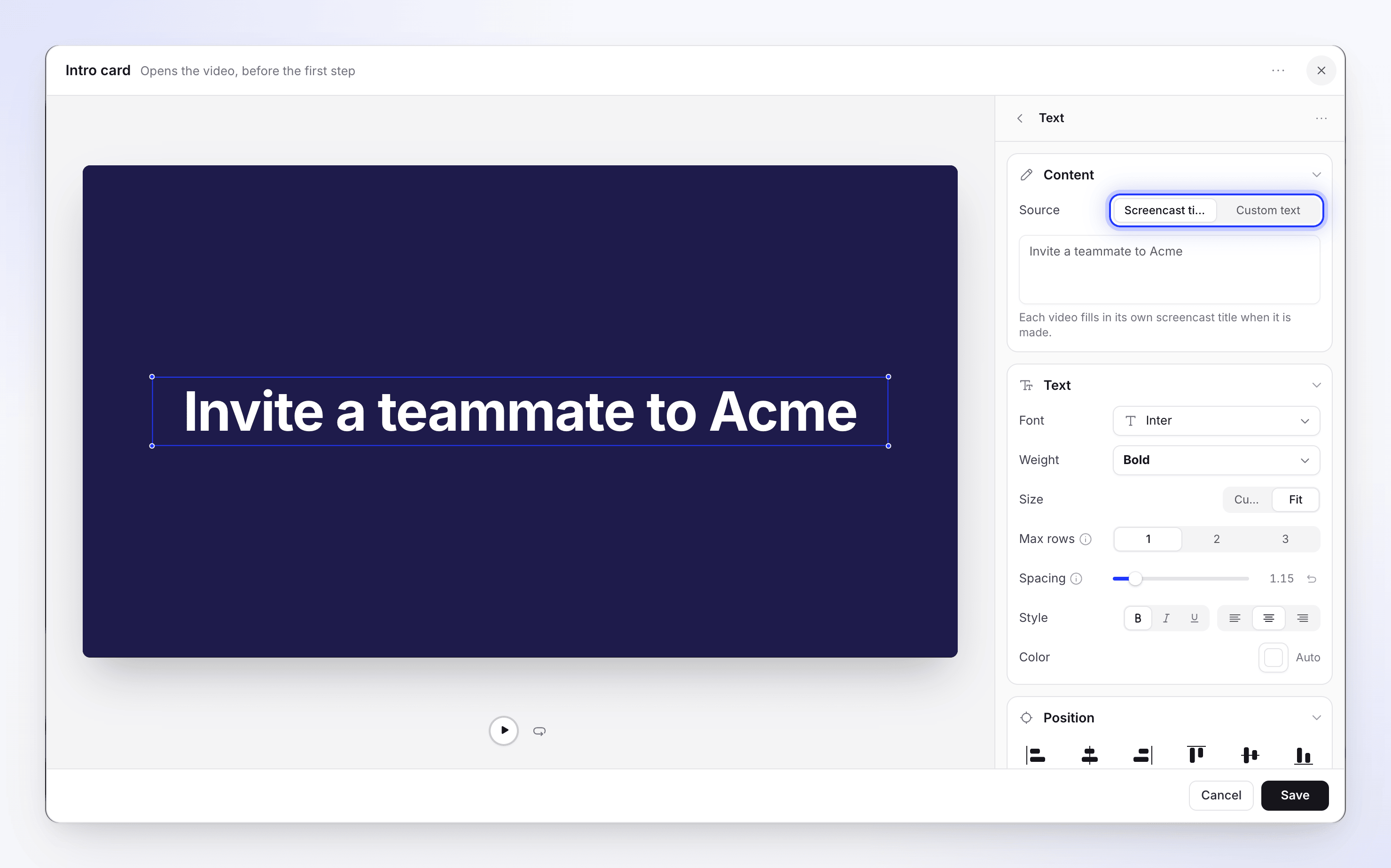
Sections in the editor:
| Section | What you set |
|---|---|
| Elements | The card's texts and images. Add text, Add image. Empty: "Nothing on the card yet". Each has a menu with Delete text / Delete image. |
| Text: Content | The words. On the intro card, Source: Screencast title ("Each video fills in its own screencast title when it is made.") or Custom text. |
| Text: Text | Font, Weight, Size (Custom, 8–240 px, or Fit with Max rows), Spacing, Style, Color |
| Text: Position | Where it sits on the card |
| Text: Animation | In and Out tabs. Effect: None, Fade, Slide, Wipe, Center build, Zoom in, Zoom out, Typewriter, Drop. Reveal by: Line, Word, Letter. Typewriter adds Typing sound and Speed. |
| Image | File |
| Background | A backdrop, color, gradient, image, motion background or none. See Card backgrounds. |
| Audio | A sound to play with the card (upload) |
| Timing | Duration, 3–10 seconds: "How long this appears on the timeline before moving on." |
A new card starts with "Add title" in Inter Bold, 76 px, centered, revealed word by word with a wipe.
Logo reveal
"Your logo drops in, then your name". Usually the last scene of a video.
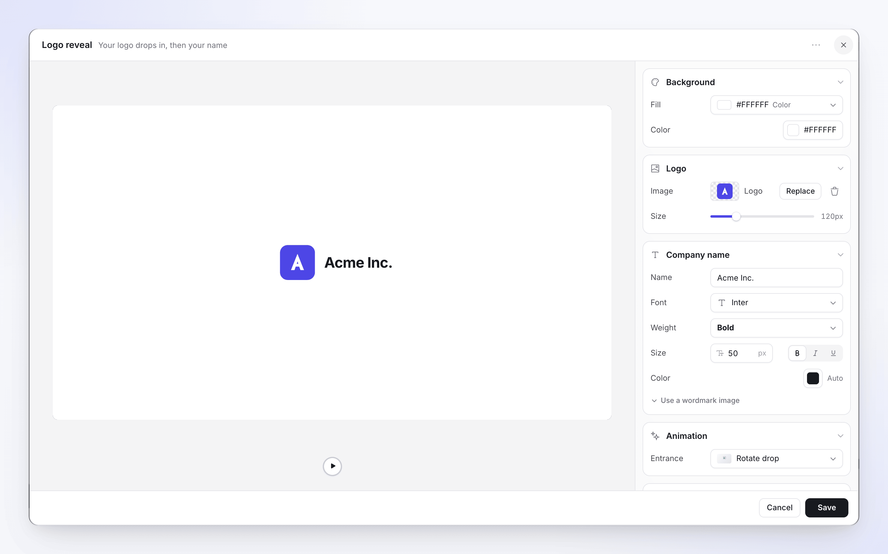
| Section | What you set | Default |
|---|---|---|
| Logo | Image ("A transparent logo icon works best"), Size 40–400 px | 120 px |
| Company name | Name, font, weight, Size 14–120, color. Or Use a wordmark image ("For a logo font that can't be matched: the image replaces the typed name."), with its Height. | Your workspace name |
| Animation | Entrance: Rotate drop or Straight drop | Rotate drop |
| Sound | One of 12 sounds, or upload your own, with volume | "Innovate Sign", 40% |
| Background | As on cards. See Card backgrounds. | Black |
| Timing | Duration, 3–10 seconds | 5 seconds |
A logo is required: "Choose a logo image to save". If your workspace has a video template with a logo reveal, new logo reveals start from its logo and design.
List
"Items revealed one by one". Use it for a feature summary or a checklist.
| Section | What you set |
|---|---|
| Design | Layout Standard, Cards or Grid; Animation; Speed (Slow, Medium, Fast) |
| Content | Heading (optional, up to 80 characters), Marker (the symbol before each item, such as Check) and Items (up to 20, each up to 48 characters; move up, move down, remove) |
| Voiceover | "One sentence per item; each item appears as it is spoken." Up to 1,024 characters. Empty: "No voiceover. The list plays with music only." |
| Typography | Fonts and the item Container (Fill, Border) |
| Background | As on cards. See Card backgrounds. |
| Timing | Duration, from the shortest the animation allows ("The shortest the list animation allows") up to 60 seconds |
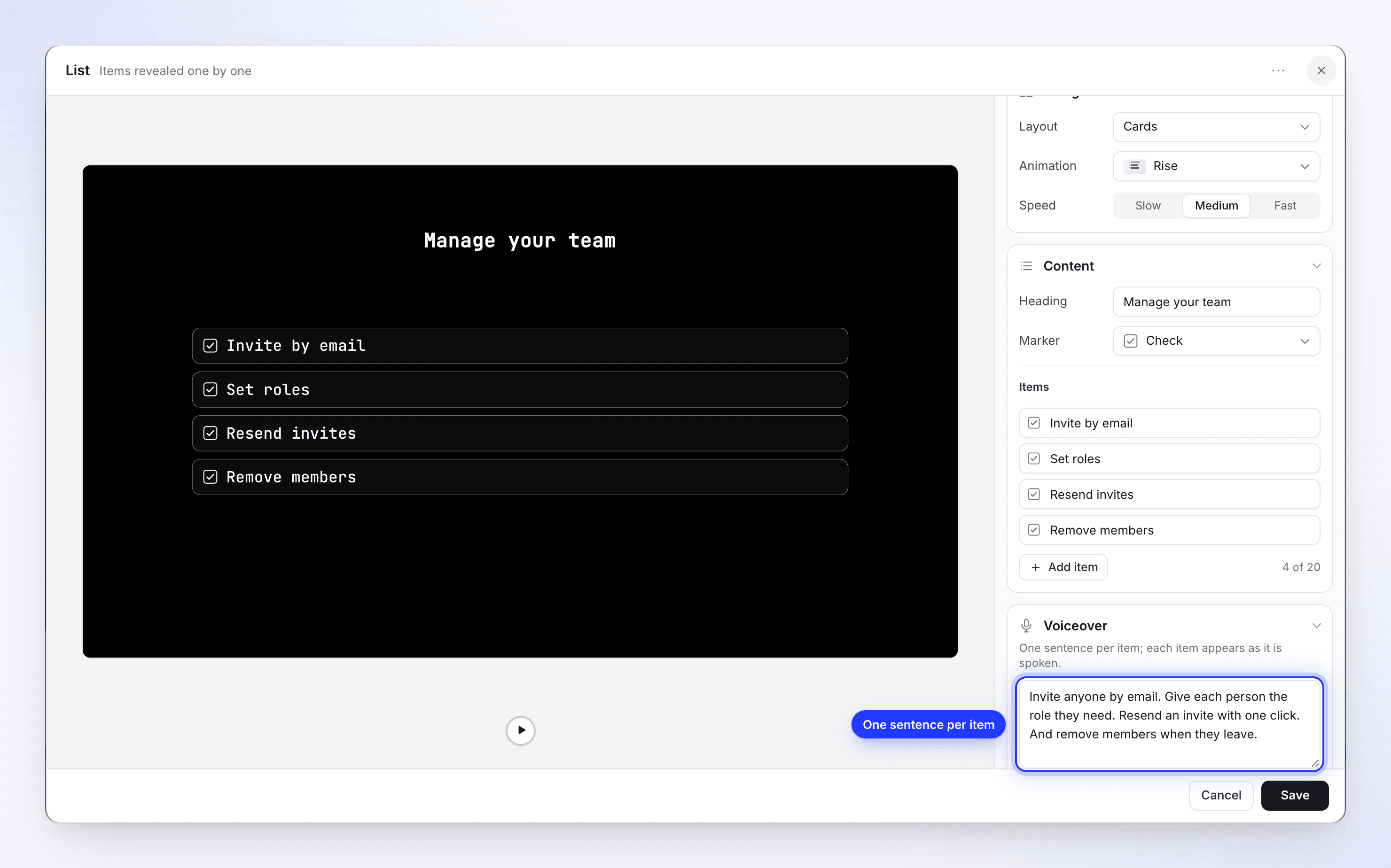
The list's voiceover is the only scene narration besides steps. It's recorded in the video's voice and supports voice tags.
Text beats
"Words that land one beat at a time". Short, punchy phrases for an opening or a key message.
| Section | What you set |
|---|---|
| Beats | Up to 10 beats ("3 of 10"). Add beat; each beat's menu has Duplicate, Move up, Move down, Delete beat. |
| A beat's Words | Up to 6 words, each removable |
| A beat's Layout | Arrange: Row or Column; Position: Top, Middle, Bottom |
| A beat's Typography and Exit | Font and "How this beat leaves" |
| Background | As on cards. See Card backgrounds. |
| Timing | Length, "set by the beats". There's no duration slider. |
Video
"A clip that plays as its own scene": a video file from your media library, such as a customer testimonial or a product teaser.
| Section | What you set | Default |
|---|---|---|
| Video | File (Choose video), Volume 0–100, Loop | 100 |
| Frame | Position, Size, Corners, Shadow and Shadow options | |
| Audio | A sound to play with it | |
| Timing | Duration, 0.1–600 seconds. When it doesn't match the file, a hint offers "Video is 12.0s · Use". | 3 seconds |
A file is required: "Choose a video to save this scene". Video files can be MP4, MOV, WebM or AVI, up to 100 MB.
Clip, Voice clip and Image
These show your own recording or pictures as a scene of their own, without AI narration.
| Scene | What it is | Edit it with |
|---|---|---|
| Clip | "Silent clip from your screen recording." A part of the recording that plays with no narration. | Sync & pacing |
| Voice clip | In Polish videos: a part of the recording with your own recorded voice | Sync & pacing. In Polish videos, Split clip at playhead cuts a clip or voice clip in two. |
| Image | "Show one of your pictures as its own scene." A still picture held on screen | Its length on the timeline |
If a video has more than one source recording, adding a Clip asks which one first.
Video cover
Some videos have a Video cover at the very start: "The opening card, shown before the first scene". It isn't a thumbnail; it plays as part of the video. Its row has Edit cover, Hide from video / Show in video (a hidden cover shows Hidden) and Delete cover ("The cover will be removed from the start of your video.").
| Section | What you set |
|---|---|
| Background | Type: Colour, Gradient, Image or Light leaks (with Pattern and Hue) |
| Title | On/off. "The video's title, set in this style." Size, font, weight, color, alignment, Placement |
| Description | On/off. Up to 500 characters ("A short line under the title"), size 10–60 |
| Logo | On/off. Image, Size 20–400, Corners, position |
| Motion | Enter (Elegant, Fade in, Slide up, Scale in, Bounce), Exit (None, Fade, Slide up, Slide down, Scale out, Blur, Mask inward, Mask outward), Duration 2–10 seconds |
| Intro sound | No intro sound or one of the sounds, with volume |
The + menu doesn't offer covers: new videos use an intro card instead.
Card backgrounds
Intro cards, title cards, logo reveals, lists and text beats each have a Background section. It only colors that card: the background around your recording is set in the Style tab (see below).
Click the Fill row to open the picker. It has one tab per kind of fill, and a search box at the top:
| Tab | What you get |
|---|---|
| Backdrops | 17 looping gradient videos, such as Coral indigo or Midnight blue |
| Color | 12 swatches, or Custom color to pick any color |
| Gradient | 18 two-color gradients. Then fine-tune From, To and Angle. |
| Image | 8 photos from Clevera's library, or Upload an image to use one of yours |
| Motion | Animated backgrounds. See Motion backgrounds. |
| None | Intro cards, title cards and logo reveals only: "The video’s wallpaper shows behind this scene." |
Picking a fill on any tab replaces the one before, including a motion background.
Clevera's backdrops are royalty-free or AI-generated, and licensed for commercial use in your videos.
Motion backgrounds
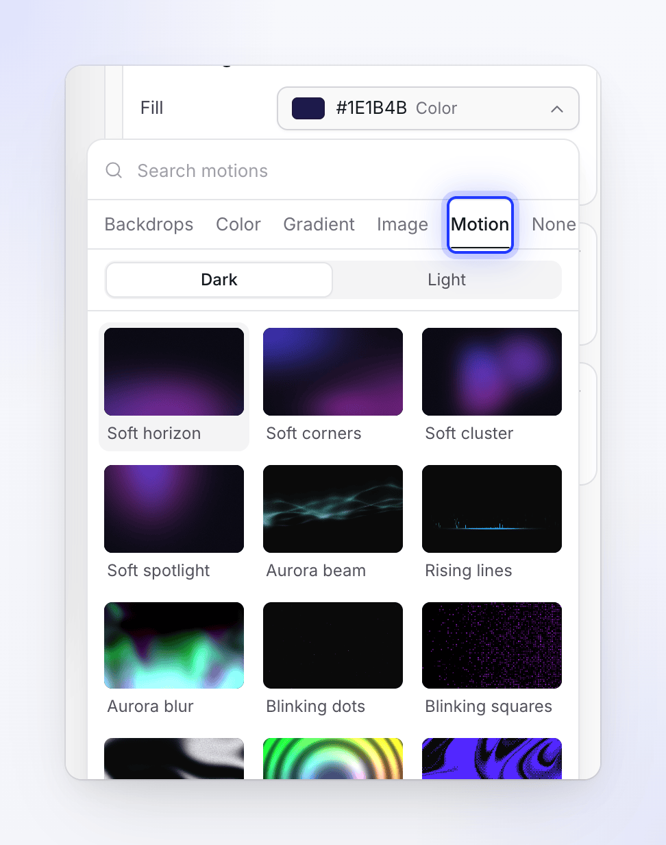
A motion background is an animated effect, such as light sweeping across the card, drifting glows or falling pixels, that keeps moving for as long as the card is on screen. There are more than 60 to choose from.
Open the Motion tab
In the card's Background section, click Fill, then the Motion tab. The tiles in view play a live preview of each effect. Type in Search motions to find one by name.
Choose Dark or Light
The switch at the top of the grid picks the version. Dark effects glow on a near-black card; Light ones are recolored to read on a pale card. Every motion has a dark version and about a third also have a light one, so the Light grid is shorter.
Pick a motion
Click a tile. The card's preview plays it, and the Fill row shows its name followed by Motion.
Adjust it
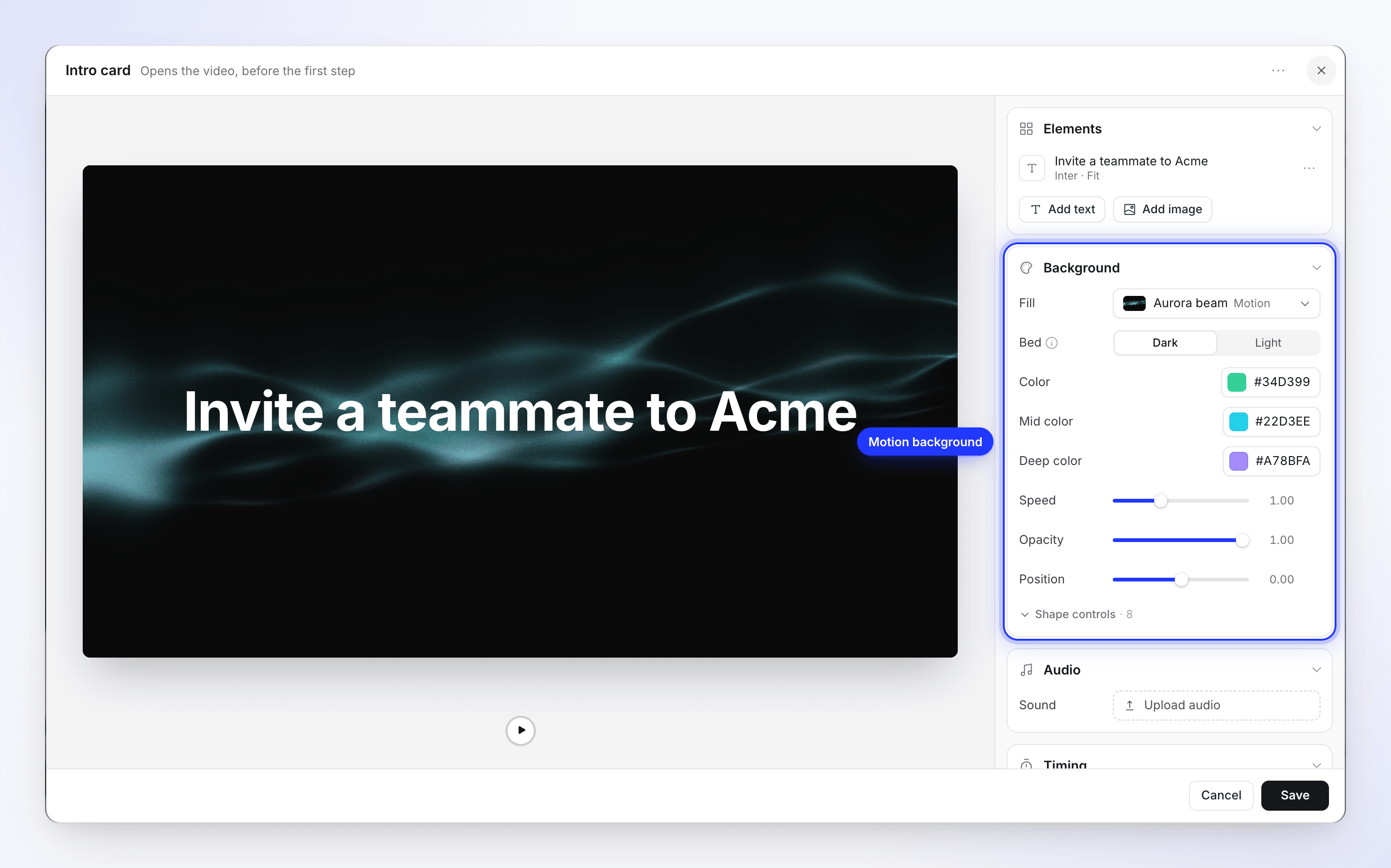
The rows under Fill depend on the motion: usually its colors and Speed, plus settings such as Opacity, Brightness, Strength or Position. Finer settings sit under Shape controls. A slider you've moved shows Reset.
| Setting | What it does |
|---|---|
| Bed | Dark or Light: the ground the effect sits on. "These effects are built to glow on near-black. Light swaps the bed and repalettes the effect so it reads on a pale scene instead." A motion with no light version is removed when you switch to Light, so you can pick a light one. |
| Colors | The effect's own colors, such as Color, Mid color and Deep color, or Accent and Accent 2 |
| Speed | How fast it moves |
| Opacity, Brightness or Strength | How strongly it shows over the bed |
| Shape controls | The finer details of that effect, such as its density, scale or grain |
The four Soft motions (Soft horizon, Soft corners, Soft cluster and Soft spotlight) are listed first. They're calm glows in two accent colors and suit cards with a lot of text.
Backgrounds: the Style tab, not a scene
The Background in the Style tab is what shows around your recording on every step. Cards have their own Background section, which only colors that card. Rows labeled Background on the timeline are background beds in social clips; you don't add them to how-to videos by hand.
Templates
Save a card's design to reuse it: ⋯ → Save as template… ("Your team can start from this design. Text is replaced when it is applied."), give it a Name and click Save template.
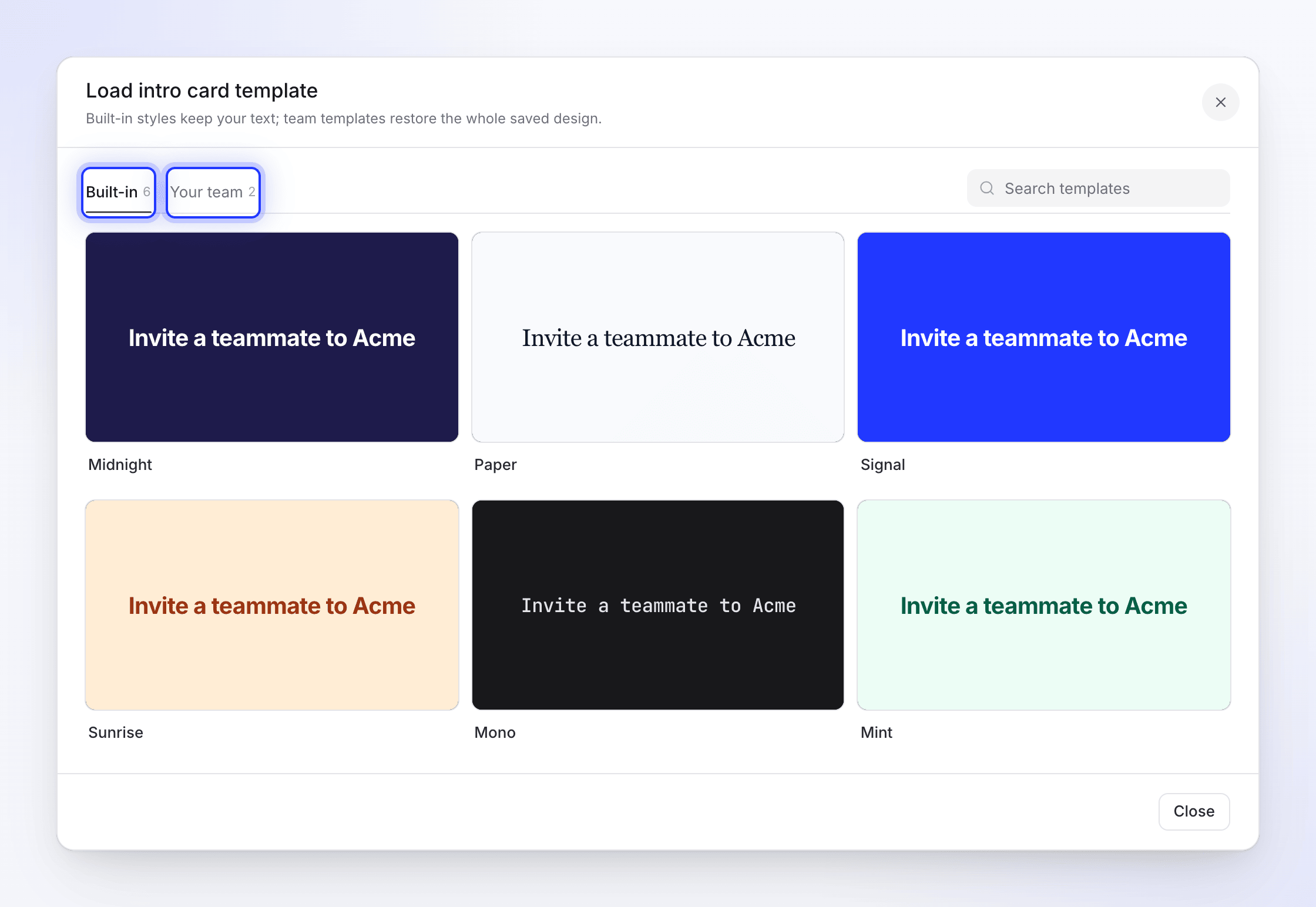
Apply one with ⋯ → Load template…. The window ("Built-in styles keep your text; team templates restore the whole saved design.") has two tabs, each with a count, and Search templates. The Built-in tab has Clevera's designs; Your team has the ones your team saved.
| You apply | What changes |
|---|---|
| A Built-in design on a title or intro card | The look. Your text and the card's duration stay. |
| A Built-in design on a logo reveal | The look. Your logo, wordmark, company name and duration stay. |
| A Built-in design on text beats | The look. Your beat words stay. |
| A Your team template | The whole saved design, including its text |
Deleting a team template asks "Delete this template?": it's removed for everyone on your team.
A workspace video template goes further: when the AI makes a video, it adds an intro card with the video's title, title cards before major chapters (at most two, and none in short videos), and a logo reveal at the end, in your design.
Scenes in other languages
When you translate a video, the words on intro cards, title cards, text beats and lists, and the company name on a logo reveal, are translated. Layout, colors, animation, images and durations stay the same. The list's voiceover is translated and recorded again. Each language then keeps its own scenes: editing a card in German doesn't change the English one. See Understand language versions.